To explore the cell values of raster layers several types of graphical summaries can be used, such as boxplots, and density plots. Scatter plots can be used to explore the relationships between the values of different raster layers.
...
Below examples of the generartion graphical summaries of the values and relationships between raster layers in R are presented. These examples are taken from the “Yasi Effects on Green Cover at Mission Beach” tutorial. Putting the code snippets in context, by looking at a broader section of the R script, could be benefitial. Boxes with grey background contain code snippets, and boxes with white background containt code (text) outputs.
We create boxplots and scatter plots (with loess) using the 'bwplot' and 'splom ' functions in the 'rasterVis' package. To create density plots we use two methods: (1) using the 'densityplot' function in the 'rasterVis' package, and (2) the 'ggplot' function in the 'ggplot2' package. The latter approach produce nicer graphs, but requires more elaborated coding. Finally, we use the 'grid.arrange' function in the 'gridExtra' package to plot multiple grobs (i.e. grid graphical objects) on a page (i.e. in a single graph).
...
| Div |
|---|
| style | background-color: #F8F9F9; border: 1px solid #666; font-size: 12px; padding: 0.5rem 0.5rem; |
|---|
|
SPGC.StudyArea.Std2010q3_2011q3.rb = brick(normImage(SPGC.StudyArea.2010q3.rl), normImage(SPGC.StudyArea.2011q3.rl))
names(SPGC.StudyArea.Std2010q3_2011q3.rb) = c("SPGC.SA.Std2010q3", "SPGC.SA.Std2011q3")
SPGC.StudyArea.Std2010q3_2011q3.rb
|
...
| Div |
|---|
| style | background-color: #F8F9F9; border: 1px solid #666; font-size: 12px; padding: 0.5rem 0.5rem; |
|---|
|
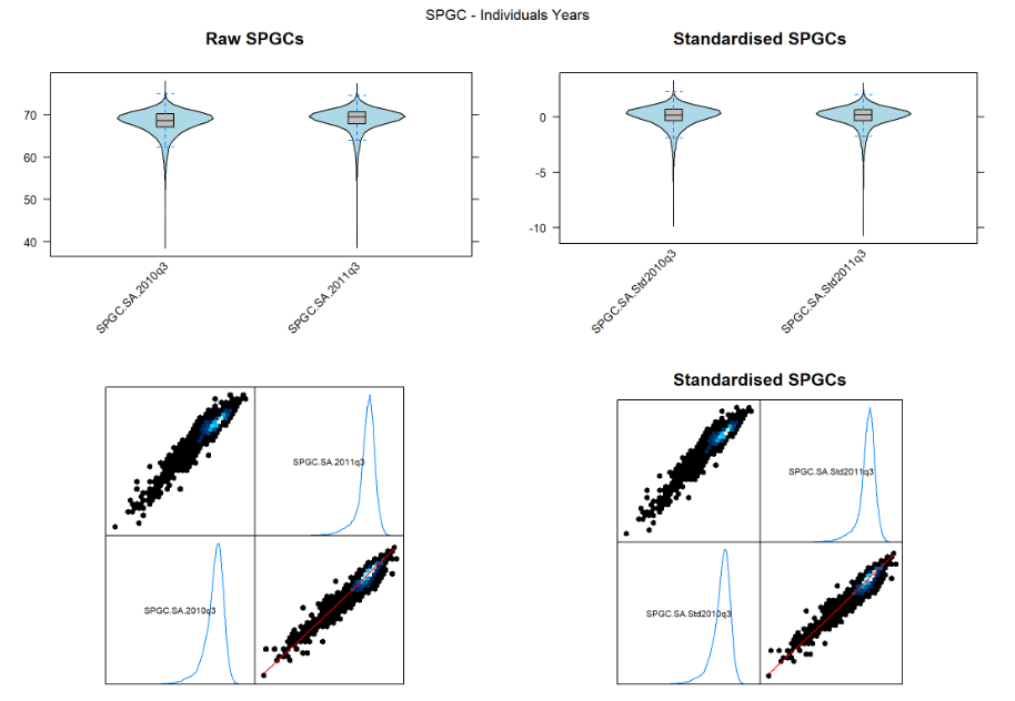
RawSPGC.IndvYrs.bwplot = bwplot(SPGC.StudyArea.2010q3_2011q3.rb, main="Raw SPGCs")
StdSPGC.IndvYrs.bwplot = bwplot(SPGC.StudyArea.Std2010q3_2011q3.rb, main="Standardised SPGCs")
RawSPGC.IndvYrs.splot = splom(SPGC.StudyArea.2010q3_2011q3.rb, plot.loess=TRUE, xlab='')
StdSPGC.IndvYrs.splot = splom(SPGC.StudyArea.Std2010q3_2011q3.rb, main="Standardised SPGCs", plot.loess=TRUE, xlab='')
grid.arrange( RawSPGC.IndvYrs.bwplot, StdSPGC.IndvYrs.bwplot,
RawSPGC.IndvYrs.splot, StdSPGC.IndvYrs.splot,
nrow=2, top="SPGC - Individuals Years" )
|
Density plots
Method 1: Using ‘densityplot’ from the ‘rasterVis’ package
...
| Div |
|---|
| style | background-color: #F8F9F9; border: 1px solid #666; font-size: 12px; padding: 0.5rem 0.5rem; |
|---|
|
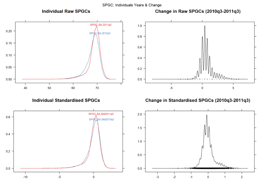
RawSPGC.IndvYrs.dp = densityplot(SPGC.StudyArea.2010q3_2011q3.rb, main="Individual Raw SPGCs")
RawSPGC.Diff.dp = densityplot(SPGC.StudyArea.Diffq3.rl, main="Change in Raw SPGCs (2010q3-2011q3)")
StdSPGC.IndvYrs.dp = densityplot(SPGC.StudyArea.Std2010q3_2011q3.rb, main="Individual Standardised SPGCs")
StdSPGC.Diff.dp = densityplot(SPGC.StudyArea.StdDiffq3.rl, main="Change in Standardised SPGCs (2010q3-2011q3)")
grid.arrange( RawSPGC.IndvYrs.dp, RawSPGC.Diff.dp, StdSPGC.IndvYrs.dp, StdSPGC.Diff.dp,
nrow=2, top="SPGC: Individuals Years & Change" )
|
Method 2: Using ‘ggplot’ from the ‘ggplot2’ package
...
| Div |
|---|
| style | background-color: #F8F9F9; border: 1px solid #666; font-size: 12px; padding: 0.5rem 0.5rem; |
|---|
|
RawSPGC.2010q3 = values(SPGC.StudyArea.2010q3.rl)
RawSPGC.2011q3 = values(SPGC.StudyArea.2011q3.rl)
RawSPGC.Diff = values(SPGC.StudyArea.Diffq3.rl)
StdSPGC.2010q3 = values(normImage(SPGC.StudyArea.2010q3.rl))
StdSPGC.2011q3 = values(normImage(SPGC.StudyArea.2011q3.rl))
StdSPGC.Diff = values(SPGC.StudyArea.StdDiffq3.rl)
SPGCs.df = data.frame( RawSPGC.2010q3, RawSPGC.2011q3, RawSPGC.Diff,
StdSPGC.2010q3, StdSPGC.2011q3, StdSPGC.Diff )
RawSPGC.IndvYrs.dflf = melt(SPGCs.df[c("RawSPGC.2010q3","RawSPGC.2011q3")])
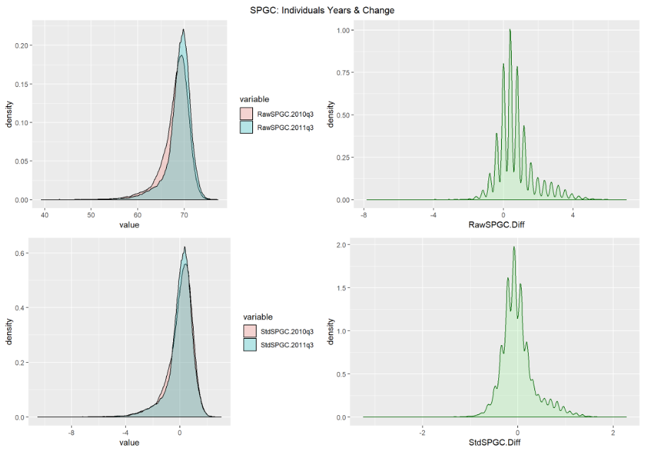
RawSPGC.IndvYrs.dp2 = ggplot(RawSPGC.IndvYrs.dflf, aes(x=value, fill=variable)) +
geom_density(alpha=0.25)
RawSPGC.Diff.dp2 = ggplot(SPGCs.df, aes(x=RawSPGC.Diff)) +
geom_density(alpha=0.25,color="darkgreen", fill="lightgreen")
StdSPGC.IndvYrs.dflf = melt(SPGCs.df[c("StdSPGC.2010q3","StdSPGC.2011q3")])
StdSPGC.IndvYrs.dp2 = ggplot(StdSPGC.IndvYrs.dflf, aes(x=value, fill=variable)) +
geom_density(alpha=0.25)
StdSPGC.Diff.dp2 = ggplot(SPGCs.df, aes(x=StdSPGC.Diff)) +
geom_density(alpha=0.25,color="darkgreen", fill="lightgreen")
grid.arrange( RawSPGC.IndvYrs.dp2, RawSPGC.Diff.dp2, StdSPGC.IndvYrs.dp2, StdSPGC.Diff.dp2,
nrow=2, top="SPGC: Individuals Years & Change" )
|