Versions Compared

Key

  • This line was added.
  • This line was removed.
  • Formatting was changed.


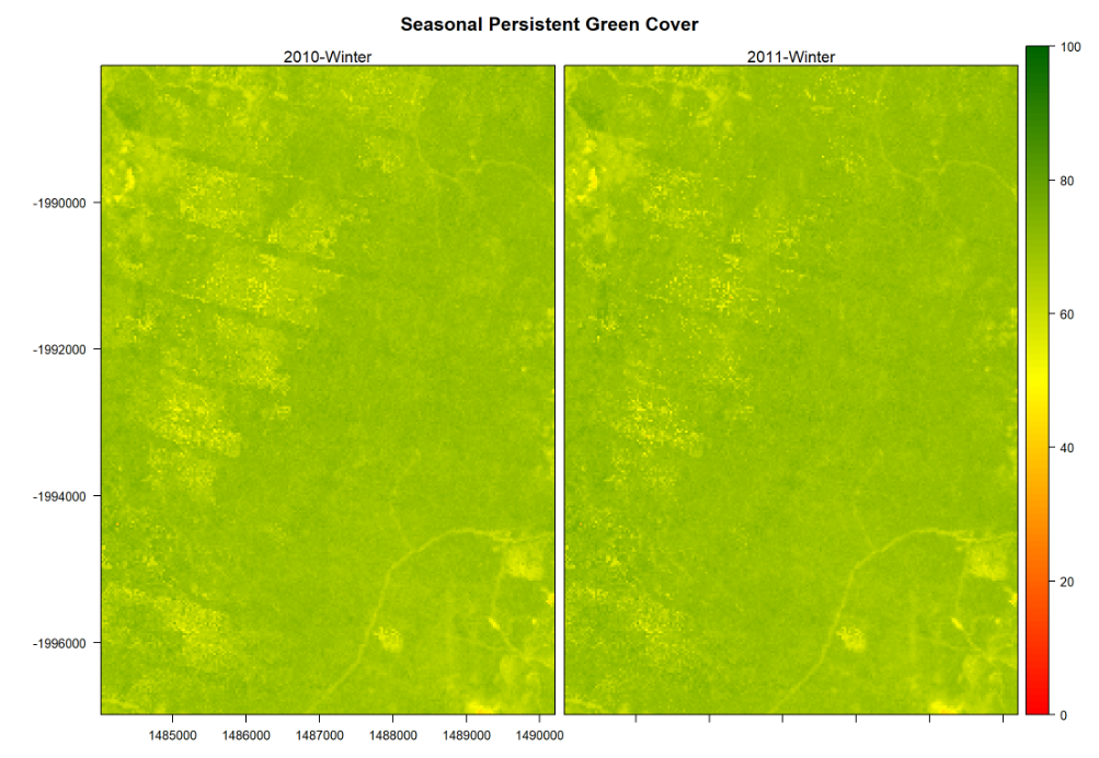
To plot the cell values of a Raster* object, we can use the 'plot' function in the 'raster' package and the 'levelplot' function in the 'rasterVis' package. The later function provides enhanced plots with relative ease.

...

Div
stylebackground-color: #F8F9F9; border: 1px solid #666; font-size: 12px; padding: 0.5rem 0.5rem;
#----------------------------------------------------------------------------------
# Graphical Summary: Plot SPGC Values for both Seasons
#----------------------------------------------------------------------------------

# Create the color palette
# ------------------------ 
# Red: low SPGCs, Yellow: middle SPGCs; Green: high SPGCs (Darker Greens indicate Higher SPGCs)
SPGC.breaks = seq(0,100,by=1)
SPGC.cols = colorRampPalette(c("red", "yellow", "darkgreen"))(length(SPGC.breaks)-1)

# Create side by side plots
# -------------------------
levelplot(SPGC.StudyArea.2010q3_2011q3.rb, at=SPGC.breaks, col.regions=SPGC.cols, main="Seasonal Persistent Green Cover", names.attr=c("2010-Winter", "2011-Winter"))


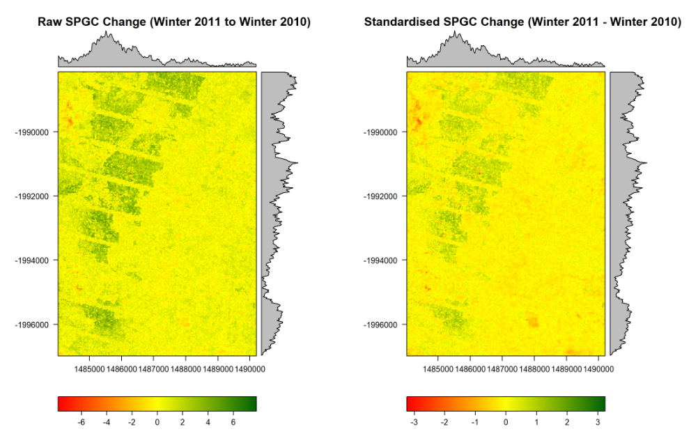
Example 2: Plot Raster with Raw & Standardised Differences between both Seasons (winter of 2010 and winter of 2011)

...

Div
stylebackground-color: #F8F9F9; border: 1px solid #666; font-size: 12px; padding: 0.5rem 0.5rem;
#-----------------------------------------------------------------------------------
# Rasters with Differences between both years (Raw & Standardised)
#-----------------------------------------------------------------------------------
# They have very differnt scales (Raw SPGC and Standardised SPGC values)


# Change in Raw SPGC 
# -------------------
#SPGC.StudyArea.Diffq3.rl

# Create the color palette
# ........................
abs.max = max(abs(values(SPGC.StudyArea.Diffq3.rl)), na.rm=TRUE)
# Red: low SPGCs, Yellow: middle SPGCs; Green: high SPGCs (Darker Greens indicate Higher SPGCs)
RawSPGC.Diff.breaks = seq(-abs.max,abs.max, by=0.01)
RawSPGC.Diff.cols = colorRampPalette(c("red", "yellow", "darkgreen"))(length(RawSPGC.Diff.breaks)-1)

# Create Raster Plots with Density Plots
# ......................................
StudyArea.RawSPGCDiff.p = levelplot( SPGC.StudyArea.Diffq3.rl, at=RawSPGC.Diff.breaks, 
                                     col.regions=RawSPGC.Diff.cols, main="Raw SPGC Change (Winter 2011 - Winter 2010)" )                               
                                   

# Change in Standardised SPGC
# ---------------------------
#SPGC.StudyArea.StdDiffq3.rl

# Create the color palette
# ........................
abs.max = max(abs(values(SPGC.StudyArea.StdDiffq3.rl)), na.rm=TRUE)
# Red: low SPGCs, Yellow: middle SPGCs; Green: high SPGCs (Darker Greens indicate Higher SPGCs)
StdSPGC.Diff.breaks = seq(-abs.max,abs.max, by=0.01)
StdSPGC.Diff.cols = colorRampPalette(c("red", "yellow", "darkgreen"))(length(StdSPGC.Diff.breaks)-1)
                            
# Create Raster Plots with Density Plots
# ......................................
StudyArea.StdSPGCDiff.p = levelplot(SPGC.StudyArea.StdDiffq3.rl, at=StdSPGC.Diff.breaks, 
                                     col.regions=StdSPGC.Diff.cols, main="Standardised SPGC Change (Winter 2011 - Winter 2010)")
                            

# Plot Raster Plots
# ~~~~~~~~~~~~~~~~~
# `grid.arrange` provides multiple plots per page. They look good on screen, 
# but might be too small in the Workshop/Tutorial report. 

# Plot Raw & Standardised Change in SPGC from the Winter of 2010 to the Winter of 2011
grid.arrange(StudyArea.RawSPGCDiff.p, StudyArea.StdSPGCDiff.p, nrow=1)