Versions Compared

Key

  • This line was added.
  • This line was removed.
  • Formatting was changed.


To plot the cell values of a Raster* object, we can use the 'plot' function in the 'raster' package and the 'levelplot' function in the 'rasterVis' package. The later function provides enhanced plots with relative ease.

Boxes with grey background contain code snippets, and boxes with white background containt code (text) outputs


EXAMPLES


Examples of visualisation of the cell values of rasters (i.e. plotting rasters) in R are presented below. The examples are taken from the “Effects of Cyclone Yasi Green Cover at Mission Beach” tutorial. It can be beneficial to put the code snippets in context by looking at a broader section of the R script. Code snippets have a grey background, and outputs have a white background.

...

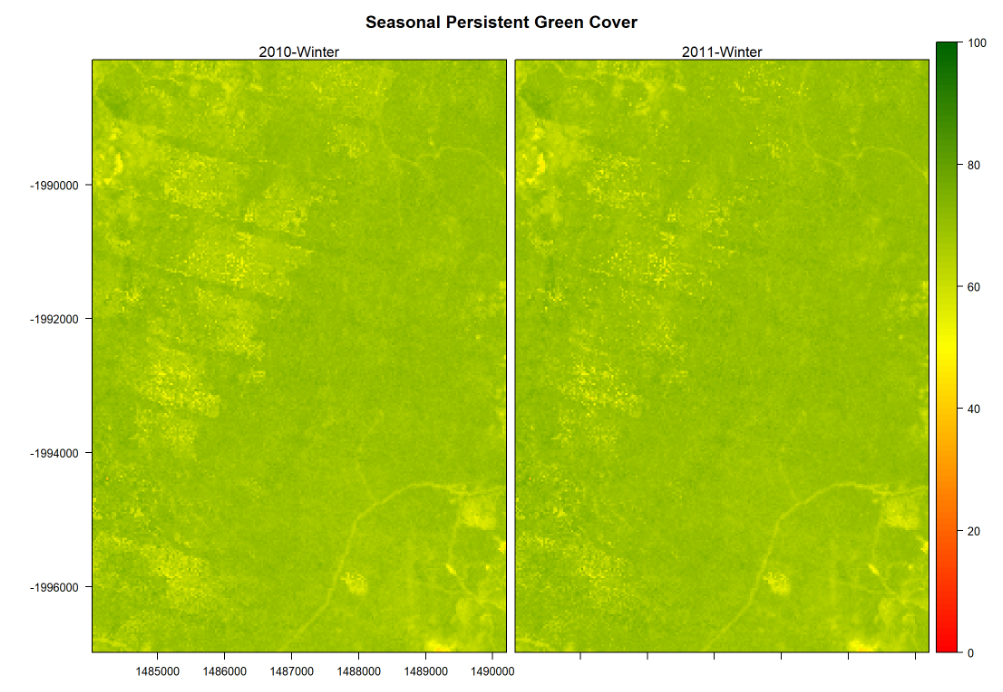
We use the function the ‘levelplot’ function to visualise the raster contents. Before using this function, we create a user defined colour palette; with yellow for low Seasonal Persistent Green Cover (SPGC) values, and green for high values. We use the 'grid.arrange' function in the 'gridExtra' package to plot multiple grobs (i.e. grid graphical objects) on a page (i.e. in a single graph).


Example 1: Plot SPGC Values for both Seasons (winter of 2010 and winter of 2011)


We create the colour palette with colours for values ranging from 0 to 100, as we are plotting percentage values.

...

Div
stylebackground-color: #F8F9F9; border: 1px solid #666; font-size: 12px; padding: 0.5rem 0.5rem;
#----------------------------------------------------------------------------------
# Graphical Summary: Plot SPGC Values for both Seasons
#----------------------------------------------------------------------------------

# Create the color palette
# ------------------------ 
# Red: low SPGCs, Yellow: middle SPGCs; Green: high SPGCs (Darker Greens indicate Higher SPGCs)
SPGC.breaks = seq(0,100,by=1)
SPGC.cols = colorRampPalette(c("red", "yellow", "darkgreen"))(length(SPGC.breaks)-1)

# Create side by side plots
# -------------------------
levelplot(SPGC.StudyArea.2010q3_2011q3.rb, at=SPGC.breaks, col.regions=SPGC.cols, main="Seasonal Persistent Green Cover", names.attr=c("2010-Winter", "2011-Winter"))


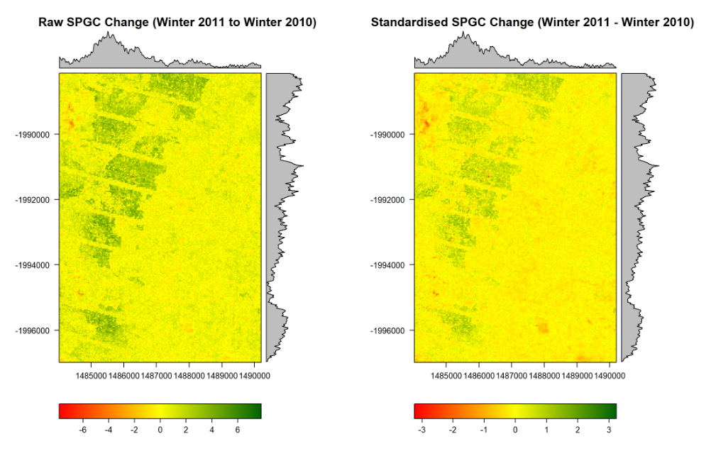
Example 2: Plot Raster with Raw & Standardised Differences between both Seasons (winter of 2010 and winter of 2011)


Here creating the colour palette is slightly more elaborated, as we estimate the range of values for the palette from the raster data (i.e. by finding the raster maximum absolute value, see code below).

...

Div
stylebackground-color: #F8F9F9; border: 1px solid #666; font-size: 12px; padding: 0.5rem 0.5rem;
#-----------------------------------------------------------------------------------
# Rasters with Differences between both years (Raw & Standardised)
#-----------------------------------------------------------------------------------
# They have very differnt scales (Raw SPGC and Standardised SPGC values)


# Change in Raw SPGC 
# -------------------
#SPGC.StudyArea.Diffq3.rl

# Create the color palette
# ........................
abs.max = max(abs(values(SPGC.StudyArea.Diffq3.rl)), na.rm=TRUE)
# Red: low SPGCs, Yellow: middle SPGCs; Green: high SPGCs (Darker Greens indicate Higher SPGCs)
RawSPGC.Diff.breaks = seq(-abs.max,abs.max, by=0.01)
RawSPGC.Diff.cols = colorRampPalette(c("red", "yellow", "darkgreen"))(length(RawSPGC.Diff.breaks)-1)

# Create Raster Plots with Density Plots
# ......................................
StudyArea.RawSPGCDiff.p = levelplot( SPGC.StudyArea.Diffq3.rl, at=RawSPGC.Diff.breaks, 
                                     col.regions=RawSPGC.Diff.cols, main="Raw SPGC Change (Winter 2011 - Winter 2010)" )                               
                                   

# Change in Standardised SPGC
# ---------------------------
#SPGC.StudyArea.StdDiffq3.rl

# Create the color palette
# ........................
abs.max = max(abs(values(SPGC.StudyArea.StdDiffq3.rl)), na.rm=TRUE)
# Red: low SPGCs, Yellow: middle SPGCs; Green: high SPGCs (Darker Greens indicate Higher SPGCs)
StdSPGC.Diff.breaks = seq(-abs.max,abs.max, by=0.01)
StdSPGC.Diff.cols = colorRampPalette(c("red", "yellow", "darkgreen"))(length(StdSPGC.Diff.breaks)-1)
                            
# Create Raster Plots with Density Plots
# ......................................
StudyArea.StdSPGCDiff.p = levelplot(SPGC.StudyArea.StdDiffq3.rl, at=StdSPGC.Diff.breaks, 
                                     col.regions=StdSPGC.Diff.cols, main="Standardised SPGC Change (Winter 2011 - Winter 2010)")
                            

# Plot Raster Plots
# ~~~~~~~~~~~~~~~~~
# `grid.arrange` provides multiple plots per page. They look good on screen, 
# but might be too small in the Workshop/Tutorial report. 

# Plot Raw & Standardised Change in SPGC from the Winter of 2010 to the Winter of 2011
grid.arrange(StudyArea.RawSPGCDiff.p, StudyArea.StdSPGCDiff.p, nrow=1)