To explore the cell values of raster layers several types of graphical summaries can be used, such as boxplots, and density plots. Scatter plots can be used to explore the relationships between the values of different raster layers.
...
| Div |
|---|
| style | background-color: #F8F9F9; border: 1px solid #666; font-size: 12px; padding: 0.5rem 0.5rem; |
|---|
|
SPGC.StudyArea.Std2010q3_2011q3.rb = brick(normImage(SPGC.StudyArea.2010q3.rl), normImage(SPGC.StudyArea.2011q3.rl))
names(SPGC.StudyArea.Std2010q3_2011q3.rb) = c("SPGC.SA.Std2010q3", "SPGC.SA.Std2011q3")
SPGC.StudyArea.Std2010q3_2011q3.rb
|
...
| Div |
|---|
| style | background-color: white; border: 1px solid #666; font-size: 12px; padding: 0.5rem 0.5rem; |
|---|
|
## class       : RasterBrick
## dimensions  : 295, 206, 60770, 2  (nrow, ncol, ncell, nlayers)
## resolution  : 30, 30  (x, y)
## extent      : 1484025, 1490205, -1996985, -1988135  (xmin, xmax, ymin, ymax)
## coord. ref. : +proj=aea +lat_1=-18 +lat_2=-36 +lat_0=0 +lon_0=132 +x_0=0 +y_0=0 +ellps=GRS80 +units=m +no_defs
## data source : in memory
## names       : SPGC.SA.Std2010q3, SPGC.SA.Std2011q3
## min values  :         -9.645614,        -10.521245
## max values  :          3.048260,          2.860489
|
 Image Removed
| Div |
|---|
| style | background-color: #F8F9F9; border: 1px solid #666; font-size: 12px; padding: 0.5rem 0.5rem; |
|---|
|
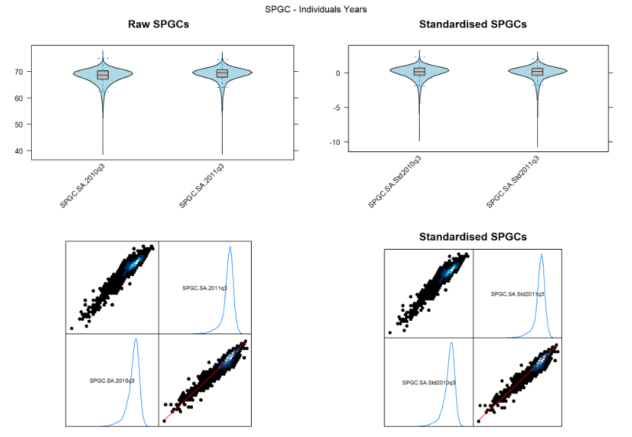
RawSPGC.IndvYrs.bwplot = bwplot(SPGC.StudyArea.2010q3_2011q3.rb, main="Raw SPGCs")
StdSPGC.IndvYrs.bwplot = bwplot(SPGC.StudyArea.Std2010q3_2011q3.rb, main="Standardised SPGCs")
RawSPGC.IndvYrs.splot = splom(SPGC.StudyArea.2010q3_2011q3.rb, plot.loess=TRUE, xlab='')
StdSPGC.IndvYrs.splot = splom(SPGC.StudyArea.Std2010q3_2011q3.rb, main="Standardised SPGCs", plot.loess=TRUE, xlab='')
grid.arrange( RawSPGC.IndvYrs.bwplot, StdSPGC.IndvYrs.bwplot,
RawSPGC.IndvYrs.splot, StdSPGC.IndvYrs.splot,
nrow=2, top="SPGC - Individuals Years" )
|
...
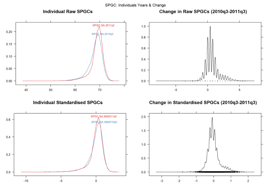
Density plots
Method 1: Using ‘densityplot’ from the ‘rasterVis’ package
...
| Div |
|---|
| style | background-color: #F8F9F9; border: 1px solid #666; font-size: 12px; padding: 0.5rem 0.5rem; |
|---|
|
RawSPGC.IndvYrs.dp = densityplot(SPGC.StudyArea.2010q3_2011q3.rb, main="Individual Raw SPGCs")
RawSPGC.Diff.dp = densityplot(SPGC.StudyArea.Diffq3.rl, main="Change in Raw SPGCs (2010q3-2011q3)")
StdSPGC.IndvYrs.dp = densityplot(SPGC.StudyArea.Std2010q3_2011q3.rb, main="Individual Standardised SPGCs")
StdSPGC.Diff.dp = densityplot(SPGC.StudyArea.StdDiffq3.rl, main="Change in Standardised SPGCs (2010q3-2011q3)")
grid.arrange( RawSPGC.IndvYrs.dp, RawSPGC.Diff.dp, StdSPGC.IndvYrs.dp, StdSPGC.Diff.dp,
nrow=2, top="SPGC: Individuals Years & Change" )
|
 Image Removed
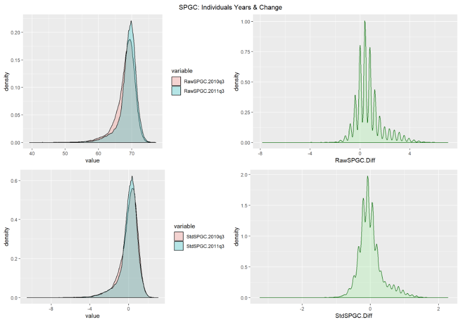
Method 2: Using ‘ggplot’ from the ‘ggplot2’ package
...
| Div |
|---|
| style | background-color: #F8F9F9; border: 1px solid #666; font-size: 12px; padding: 0.5rem 0.5rem; |
|---|
|
RawSPGC.2010q3 = values(SPGC.StudyArea.2010q3.rl)
RawSPGC.2011q3 = values(SPGC.StudyArea.2011q3.rl)
RawSPGC.Diff = values(SPGC.StudyArea.Diffq3.rl)
StdSPGC.2010q3 = values(normImage(SPGC.StudyArea.2010q3.rl))
StdSPGC.2011q3 = values(normImage(SPGC.StudyArea.2011q3.rl))
StdSPGC.Diff = values(SPGC.StudyArea.StdDiffq3.rl)
SPGCs.df = data.frame( RawSPGC.2010q3, RawSPGC.2011q3, RawSPGC.Diff,
StdSPGC.2010q3, StdSPGC.2011q3, StdSPGC.Diff )
RawSPGC.IndvYrs.dflf = melt(SPGCs.df[c("RawSPGC.2010q3","RawSPGC.2011q3")])
RawSPGC.IndvYrs.dp2 = ggplot(RawSPGC.IndvYrs.dflf, aes(x=value, fill=variable)) +
geom_density(alpha=0.25)
RawSPGC.Diff.dp2 = ggplot(SPGCs.df, aes(x=RawSPGC.Diff)) +
geom_density(alpha=0.25,color="darkgreen", fill="lightgreen")
StdSPGC.IndvYrs.dflf = melt(SPGCs.df[c("StdSPGC.2010q3","StdSPGC.2011q3")])
StdSPGC.IndvYrs.dp2 = ggplot(StdSPGC.IndvYrs.dflf, aes(x=value, fill=variable)) +
geom_density(alpha=0.25)
StdSPGC.Diff.dp2 = ggplot(SPGCs.df, aes(x=StdSPGC.Diff)) +
geom_density(alpha=0.25,color="darkgreen", fill="lightgreen")
grid.arrange( RawSPGC.IndvYrs.dp2, RawSPGC.Diff.dp2, StdSPGC.IndvYrs.dp2, StdSPGC.Diff.dp2,
nrow=2, top="SPGC: Individuals Years & Change" )
|
...